Your project page is often the first impression you give to a new player, so it is crucial that you present your mod/modpack as best as it can be!
In this guide, we have included tips to help you create an engaging and polished project page. Remember, each project is unique and might have specific needs and ways to convey information. Feel free to tailor these suggestions to best suit your project, and if you need any personalized advice, we are here to help!
Project Format
Summary
- This section of your project page should provide a brief overview of the mod or modpack, explaining the project's purpose and synopsis.
Description
- Generally, your project description must contain what the project adds or changes within the game, and while it can include descriptive/storytelling language, it must also contain functional information to tell users what the project does
- You should avoid generic terms such as "adds items to the game," "changes the vanilla game," etc.
- Keep in mind that this section will change heavily depending on the type of project you are making.
Media
- In this section, you should include relevant media (videos, images, etc.) to showcase your mod/modpack's content.
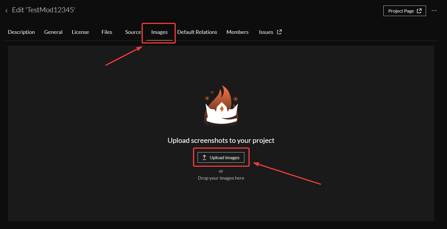
- We recommend using your project's "Images" page to showcase as many examples of in-game features and content as possible.

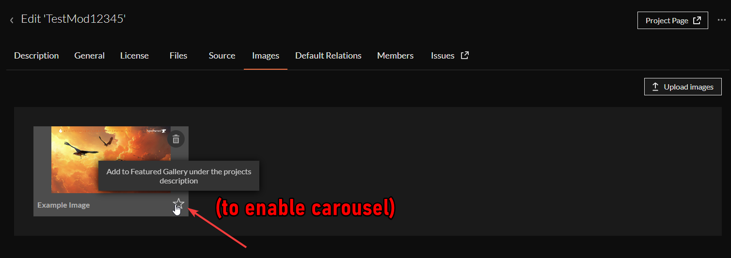
- Additionally, ensure that you enable the carousel at the top of your project page and that your Images are in good order to help highlight important features or content.

Tutorials/Questions
- If there are any basic instructions or commonly asked questions, it may be a good idea to have them easily accessible on your project page.
Socials
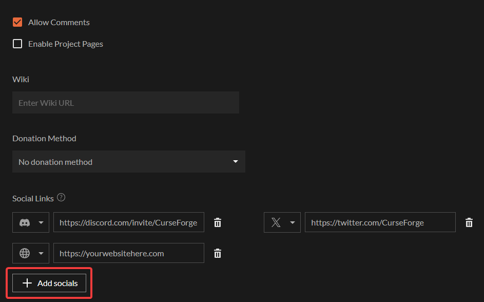
- We strongly suggest having links to your Discord or other relevant social media (use our new social media feature in the Authors console!)

- Socials must either be at the bottom of the project description or in badge format at the top of the page. They must be a reasonable size so as not to overwhelm the page.
- You can find some more information on what is and isn't allowed on project pages in our Moderation Policies.
Project Design
- Your project page should be informative and aesthetically pleasing, too! This can help draw users' attention and encourage them to read more.
- We recommend using headers/banners on your project page and any images where possible.
- We recommend using images to explain how certain features work or showcase a cool model - does your mod add a new boss? Why not show it off?
- This can both help encourage users to install your mod/modpack and also give users an understanding of the type of content to expect.
Easy to Understand
- Your project page should include as much information as possible without being overbearing to the user. Make sure that any key instructions or necessary information are visible and clear.
- While being informative, your project page must be easy to understand.
- Don't use too many technical terms or jargon, keep things easily understandable, and, as mentioned earlier, make use of images to help explain complex features and mechanics.
Project Names & Icons
- Projects tend to do better when they have a unique name that is memorable and easy to search.
- The same applies to project avatars – try to create something unique!
Conclusion
In conclusion, it's important to remember that your project page is the best way to showcase your project to users and encourage them to download it. How you present your project can significantly impact its success.
Consider that the majority of viewers are common users who may not have specialized knowledge. It's crucial that you take this into account when designing and phrasing your project page.
Use straightforward language and engaging visuals, and ensure that your project's key features are well-described.
Feel free to contact our community team in our CurseForge Dev Discord with any questions or need for help. Good luck!